Minimalist Graphic Design: 10 Key Principles
Aug 26, 2024
Minimalist graphic design focuses on simplicity and clarity. Here are the 10 key principles:
Simplicity is key
Use empty space well
Limited color palette
Typography matters
Form follows function
Grid-based layouts
Visual hierarchy
Minimalist imagery
Consistency in design
Using contrast well
These principles help create clean, effective designs that communicate clearly. By removing clutter and focusing on essential elements, minimalist design stands out in today's busy visual world.
To apply these principles:
• Start with a clear message
• Use minimal colors and fonts
• Embrace white space
• Remove non-essential elements
• Ensure readability and usability
Related video from YouTube

What is Minimalist Design?
Minimalist design is a simple approach in graphic design. It focuses on keeping things clear and useful. This style became popular in the late 1960s and early 1970s, starting in American visual art. Now, it's widely used in modern visual communication.
The main idea of minimalist design is "less is more." This means:
1. Keeping it simple: Remove extra parts and use only what's needed.
2. Making it work well: Focus on how it works, not just how it looks.
3. Being clear: Make designs easy to understand.
4. Using space well: Use empty space to make designs look good.
Minimalist design works well today because people are busy and easily distracted. By using fewer parts and focusing on the main message, these designs can:
Make the message clear
Look good
Be less distracting
Help people focus
Look modern
When used in graphic design, minimalism helps make things easier to use. It lets designers share information quickly and clearly.
In practice, minimalist graphic design often means:
Using only one or two types of text
Using few colors
Leaving lots of empty space
Showing only the most important information
Using simple shapes and straight lines
1. Simplicity is Key
Simplicity is the main idea in minimalist graphic design. It's about removing extra things and focusing on what's important to make a clean, simple look.
Main Parts
In minimalist design, every part must have a reason to be there. Start by taking out anything that's not needed and focus on the main things. This helps the most important parts of your design stand out. When making your design, ask: "Does this part help the message or how it works?" If not, think about removing it.
Empty Space
Empty space, also called white space, is very important in minimalist design. It's not just blank space, but a useful tool that makes the design balanced. Good use of empty space can:
Make important parts stand out
Make things easier to read
Make the design look neat
Don't be afraid to use lots of empty space. It gives the viewer's eyes a break and helps show what's important.
Colors
In minimalist design, using fewer colors is better. Stick to a small set of colors, often using plain colors like white, black, and gray. This makes the design look clean and simple, which looks good and works well.
Remember, each color you pick should have a reason to be there. Use colors to guide people's eyes and show your message clearly.
Text Styles
The way you use text is very important in minimalist design. Choose simple, clean text styles that fit with the simple look. Don't use fancy or decorated text that can make the design less simple.
When picking text styles:
Use one or two text styles at most
Use different sizes and thicknesses to show what's most important
Make sure it's easy to read
2. Use Empty Space Well
Empty space, also called white space, is very important in simple graphic design. It's not just blank space, but a useful tool that makes designs look better and work well.
Main Uses
Empty space helps in several ways:
Makes text easier to read
Shows what's most important
Guides where people look
Makes designs look nice
By using empty space well, you can make designs that look good and are easy to use.
Space Around Things
The space around design elements is important. It:
Separates and groups things
Helps organize content
Reduces clutter
Makes designs easier to use
For example, the Louvre Museum in Paris uses space well in its pyramid entrance. This shows how empty space can make a place look grand and help manage big crowds.
Using Color
In simple design, empty space doesn't have to be white. It's any empty area in your design. But using white or light colors can make designs look clean and nice.
Remember, use color to highlight important parts and make the design look balanced.
Text Sizes
How you use text is very important in simple design. Empty space can help show which text is most important:
Put more space around headings to make them stand out
Add more space between lines to make text easier to read
Use big margins to make the design look clean
3. Limited Color Palette
Using fewer colors is a key part of simple graphic design. It helps make designs look clean and easy to understand.
Color Strategy
When picking colors for a simple design:
Start with basic colors: Use white, black, or gray as your main colors. These make a clean background.
Add one or two extra colors: Pick colors that fit your brand or message. These colors should help make your design better.
Use different shades: Make your colors lighter or darker to add depth without using new colors.
Think about how colors make people feel: For example, blue can make people think of trust, while green might make them think of nature.
Remember, using fewer colors is better. This helps make your design clear and lets important parts stand out.
Empty Space
Empty space is very important in simple design. It helps make your colors look better. Here's how to use empty space well:
Make things stand out: Use empty space to make your colors look brighter.
Make text easier to read: Leave space around words to make them easier to see.
Make things look even: Put empty space in the right places to make your design look balanced.
4. Typography Matters
Good text design is key in simple graphic design. It helps share your message clearly while keeping things simple.
Main Parts
Picking the right font is important. Simple fonts without extra lines (sans-serif) often work well. But fonts with small lines (serif) can also be good if they're not too fancy. When choosing a font, look for:
Simple look
Easy to read
Works well in different sizes
Think about how the font makes people feel and if it fits your message. For example, a thick font might look strong, while a thin one might look fancy.
Text Size and Style
Using different text sizes and styles helps people know what to read first. Here's how:
Use different text sizes, thicknesses, and colors to show what's important
Use only 1-3 fonts to keep things simple
Make titles bigger to catch people's eye
Empty Space
Using empty space around text is important in simple design. It can:
Make the design look even
Make text easier to read
Help people focus on what's important
Remember, in simple design, less is often better. Don't use too many special text styles like slanted or underlined words. This can make your design look messy.
5. Form Follows Function
In simple graphic design, "form follows function" means that how something looks should match what it does. This idea helps make designs that work well and look good.
Main Parts
When using this idea in simple design, think about:
Easy to Use: For websites and apps, make sure everything is easy to use. Each part should have a clear job and help people use the design.
Works Well: Make designs that load fast and run smoothly, especially online.
Clear Message: In graphics and moving designs, focus on sharing information clearly. Every part you see should help tell the story or share the idea.
Text Sizes and Styles
How you use text is very important:
Pick text that's easy to read on different things like signs or websites.
Use different text sizes to show what's most important.
Choose text that works well in different sizes and places.
6. Grid-Based Layouts
Grid-based layouts help organize designs in minimalist graphic design. They create neat, easy-to-understand layouts that guide viewers and improve how information is shared.
Main Parts
Key parts of grid-based layouts in simple design include:
Columns: Split the page into columns to make a balanced layout.
Lining things up: Use the grid to line up text, pictures, and other parts.
Empty space: Leave space between grid parts to keep things clear.
Designers can use ready-made grids or make their own to create unique layouts while keeping things consistent.
Empty Space
In simple grid layouts, empty space is important:
Makes key parts stand out by putting space around them
Shows what's most important and makes things easier to read
Makes the design look better overall
By using empty space well within the grid, designers can make clean, uncluttered designs.
Text Sizes
Grid layouts help show different text sizes in simple design:
Putting different text in specific grid spots helps show what's most important and makes reading easier.
Using grid layouts in simple graphic design makes things look better and work better for users. Grids give a clear structure, helping designers make good choices and save time. This leads to designs that look more polished and professional.
7. Visual Hierarchy
Visual hierarchy helps guide viewers' eyes and organize information in simple graphic design. By arranging elements carefully, designers can make clear layouts that share messages well.
Main Parts
The main parts of visual hierarchy in simple design are:
Size: Bigger things catch more attention
Color: Different colors can make important parts stand out
Spacing: Using empty space highlights key information
Placement: Where things are affects how important they seem
Designers should think about these parts to make a clear path for viewers to follow, making sure the most important information stands out.
Empty Space
Empty space, also called white space, is very important in simple design and visual hierarchy. It helps:
Make key parts stand out by putting space around them
Make things easier to read by reducing clutter
Make the whole design look balanced
By using empty space well, designers can guide viewers' eyes and make the design look better overall.
Text Sizes
How text looks is a big part of visual hierarchy in simple graphic design. It involves:
Using different text sizes to show what's important
Using different text thicknesses (like bold or regular) to create contrast
Picking text styles that work well together for titles and main text
Using text sizes well helps readers quickly understand the main points and move through the content easily.
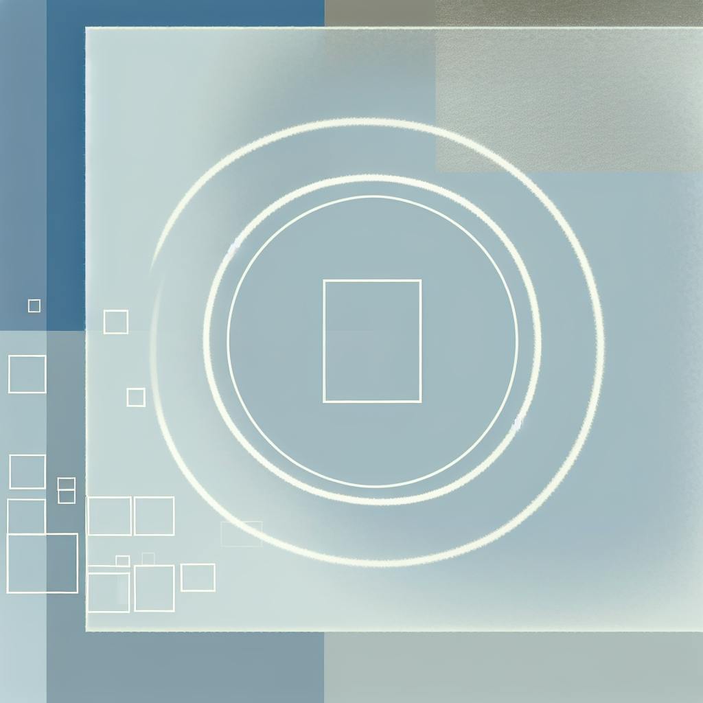
8. Minimalist Imagery
Minimalist imagery in graphic design uses simple, clear visuals to make a strong impact. By removing extra details, designers can create images that share ideas well.
Main Parts
When making minimalist images, think about these key things:
Keep it simple: Focus on one main subject or idea
Use empty space: Leave blank areas to highlight the main subject
Use clean shapes: Include clear geometric shapes for better understanding
Use few colors: Stick to a small set of colors to keep things simple
Empty Space
Empty space is very important in minimalist images:
It helps make the main subject stand out
It makes the image look balanced
It lets viewers focus on what's important
To use empty space well:
Try different angles to make unique layouts
Cut out distracting parts to show patterns or shapes
Balance the main subject with the space around it
Color Use
Using colors well is key for minimalist images:
Use only a few colors to make the image look neat
Try using shades of one color or colors that look good together
Use high contrast to make things stand out
Use bright colors carefully to draw attention to specific parts
9. Consistency in Design
Keeping things the same across your design helps make it look good and easy to understand. This is very important in simple graphic design.
Main Parts
To make your designs look the same:
Use the same fonts, colors, and design parts in all your work
Make sure important things stand out the same way in all designs
Make a list of rules for how your designs should look
Use the same design ideas for all your materials, like websites and posters
10. Using Contrast Well
Contrast helps make simple graphic designs look good and easy to understand. It guides people's eyes to important parts of the design.
Main Parts
Contrast in simple design is more than just black and white. It includes differences in:
Color: Using different colors or shades
Size: Mixing big and small parts
Space: Changing between tight and loose layouts
Feel: Putting smooth and rough parts together
Text: Using different text styles
By using these parts carefully, designers can make designs that look good and share messages clearly.
Color Use
Using color contrast well can make a big difference in simple design:
When using color contrast, use only a few colors to keep things simple. One bright color can make important parts stand out without making the design too busy.
Text Styles
How you use text is very important for making contrast in simple designs:
1. Different Sizes: Use big and small text to show what's most important.
2. Different Thicknesses: Mix thick and thin text to make important parts stand out.
3. Different Styles: Use plain and fancy text together to make the design interesting while keeping it easy to read.
How to Apply These Principles
Here's how to use simple design ideas in your work:
Start with a Clear Idea
Before you start designing, know what you want to say. Simple design is about picking the right parts, not just taking things away. Think about your main message and build your design around it.
Use Few Colors
Pick a small set of colors that fit your idea and the feeling you want to create. Using fewer colors keeps things simple and neat.
Use Empty Space
Don't be afraid of empty space. Use it to:
Make things look even
Show people where to look
Make important parts stand out
Empty space helps make your design clear and easy to read.
Focus on Text
Text is very important in simple design. Pick text that's easy to read and fits your project. Think about:
How much space is between letters and lines
Lining things up
Making some text bigger or bolder to show it's important
Use only one or two types of text to keep things looking the same.
Take Things Out
Simple design often means taking things out. Keep looking at your design and ask if each part is needed. If something doesn't help tell your story or make the design look better, think about taking it out. You might need to change your design many times to make it as simple as possible while still working well.
Things to Watch Out For
1. Making it too simple: Keep things clear and working well, even when making them simple.
2. Not enough difference: Make sure people can see the difference between parts of your design.
3. Not working well: Make sure your design looks good and is easy to use.
4. Not looking the same: Keep the same style in all parts of your design.
Conclusion
Simple graphic design is a good way to make things look nice and easy to understand. It uses basic ideas to make designs that people like and remember.
The main ideas of simple design work together to make things look good and work well:
Keep it simple
Use empty space
Use few colors
Use clear text
These ideas help make designs that are:
Easy to use
Stand out
Clear to understand
This is good for today's busy world where people see many things all the time.
Simple design is good at getting people's attention. It does this by taking away extra things and focusing on what's important. This helps people see the main message or brand quickly.
Simple design ideas still work well today. They can be used for websites, company logos, or printed things. By using these ideas carefully, designers can make things that look good, are easy to understand, and work well for a long time.
FAQs
How to make minimalist graphic design?
To create minimalist graphic design:
Start with a clear idea
Use few colors
Use empty space well
Focus on text
Remove extra parts
Keep it simple. Make designs that look good and work well by using only what's needed.
How do you design minimalist?
To design minimalist:
Use simple shapes
Make sure it works well
Show what's important
Use empty space
Pick easy-to-read text
Use few colors
Try to make designs that look even and clear, where every part has a job.