White Space in Design: 10 Tips for Clean Layouts
Sep 1, 2024
White space is crucial for creating clean, professional designs. Here are 10 tips to use it effectively:
Understand its purpose
Balance content and white space
Create hierarchy
Use margins and padding
Set proper line spacing
Give images breathing room
Implement grid systems
Optimize for mobile
Group related elements
Embrace empty space
These tips apply to websites, marketing materials, and product packaging. Using white space well makes designs look cleaner, more professional, and easier to understand.
Related video from YouTube
1. Understand the Purpose of White Space
White space, also called negative space, is the empty area in a design. It's not just blank space.
Using white space well can:
Help people read your content
Point out important parts
Make your design look organized
Give your brand a professional look
Make websites and apps easier to use
When you're making designs, think about how white space can help get your message across clearly.
2. Balance Content and White Space
Finding the right mix of content and white space is key for clean, professional designs. Here's what to keep in mind:
1. Use the 60-30-10 rule
2. Use white space wisely
3. Don't overcrowd
Don't try to fill every space
Give elements room by using good margins
Remember: white space isn't wasted - it's a useful tool
3. Use White Space to Create Hierarchy
White space helps show what's important in your designs. By using it well, you can guide viewers and highlight key parts. Here's how to use white space for hierarchy:
1. Change spacing between parts
Adjust white space around different elements to show their importance.
2. Group related items
Use white space to show which things go together:
Put related parts close to each other
Leave more space between different sections
Make content areas clearly separate
3. Highlight key info
Put more white space around important parts to draw attention:
Make important numbers or facts stand out
Help key messages pop from other content
Create a focus point for the most important info
4. Use Margins and Padding
Margins and padding help create clean layouts with good white space. Here's how to use them:
Margins:
Create space around elements
Keep margins the same for a neat look
Change margins to control how close things are
Padding:
Add space inside elements
Make text easier to read
Use more padding for buttons to make them easy to click
Tips:
Start with basic margins and padding, then adjust
Use em or rem units for designs that work on different screens
Keep margins and padding the same for similar items
5. Use Line Spacing for Easy Reading
Line spacing, also called leading, helps make text easier to read and creates a clean look. Good line spacing lets readers move from one line to the next without trouble, making reading less tiring and helping them understand better.
Here's how to use line spacing well:
Set the right space: Use 1.5 to 2 times the font size for space between lines. This gives enough room without making text look too spread out.
Think about font size: Bigger fonts usually need more space between lines. Smaller fonts can have less space. Try different options to see what looks best.
Keep it the same: Use the same line spacing throughout your design. This makes everything look neat and organized.
Add space between paragraphs: Put extra space between paragraphs to break up the text. This helps readers see where one part ends and another begins.
Change for different screens: You might need to adjust line spacing for phones, tablets, or computers to keep text easy to read.
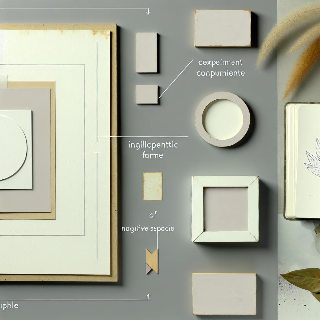
6. Create Breathing Room Around Images
Images are important in design, but they need space to look good. Putting space around images makes them stand out and helps the whole design look better. Here are some tips for using space with images:
1. Use the same space all around: Put the same amount of space on all sides of an image. A good rule is to use space that's 5-10% of how wide the image is.
2. Think about what's in the image: Change the space based on what the image shows. For example, if there's one main thing in the image, more space around it can make people look at it.
3. Make sure text fits well: When you put images next to words, leave enough space so it doesn't look crowded. This makes it easier to read and look at.
4. Use space to show what's important: Put more space around the most important images to make them stand out.
5. Make it work on all screens: Make sure the space around images looks good on phones, tablets, and computers.
Here's a table to help you remember how much space to use.
7. Use Grid Systems
Grid systems help make clean, organized layouts with good white space. They give a structure that helps line up parts and spread content evenly in a design. Here's how to use grid systems to manage white space better:
Pick the right grid type:
Set good gutters: Gutters are spaces between columns. They make natural white space and make reading easier. For computer screens, make gutters 20-40 pixels wide.
Line things up with the grid: Put text boxes, images, and other parts on the grid lines. This makes things look neat and lets white space flow through your design.
Group things in grid areas: Put several grid boxes together to make bigger spaces for content. This helps make clear sections in your design and puts white space between different parts.
Keep it the same: Once you choose a grid system, use it in all of your design. Using the same grid makes everything look neat, with white space spread evenly.
Remember, you can be flexible with grids. It's okay to break the grid sometimes to make something stand out, but do it on purpose and not too often.
8. Make Designs Work on Mobile
When using white space in designs, it's important to think about how they'll look on phones. This helps keep your design clean and easy to use on all screen sizes.
Here's how to make white space work well on mobile:
Change spacing: Use less space around things on small screens. This helps show more content while keeping it easy to read.
Show what's important: Use white space to make key parts stand out. Hide or fold away less important info on phones.
Stack things up: On phones, put things in one column instead of side by side. Leave enough space between stacked items.
Make buttons easy to tap: Put more space around things people can click. This makes them easier to use on touchscreens.
Use flexible grids: Make grids that change with screen size. This keeps white space looking good on all devices.
9. Use White Space to Group Related Elements
White space helps organize your design. It can show which parts belong together and make your layout easier to understand.
Here's how to use white space for grouping:
Put related things close: Keep similar items near each other. Leave more space between different groups.
Use the same spacing: Keep the space between items in a group the same. This makes the group look neat.
Use big spaces to separate: Put large areas of white space between different sections of your page.
Show what's important: Use more white space around main groups. Use less for smaller groups inside.
Use a grid: Line up your groups with a grid. This makes everything look tidy.
10. Don't Be Afraid of Empty Space
Many new designers try to fill every part of their layout. But empty space is good for making clean, professional designs. Here's why you should use empty space:
Helps People Focus: Empty space points out the main parts of your design, making your message clear.
Makes Reading Easier: Putting space around text and pictures helps people read and understand better.
Makes Things Look Even: Empty space helps balance your design so it's not too busy.
Looks High-End: Many expensive brands use lots of empty space to look fancy.
Makes Designs Work Better: Using empty space well can help people use your design more easily.
Remember, empty space isn't wasted. It's an important part of design that can make your work look much better. Don't worry about leaving some areas empty – sometimes, using less makes your design stronger.
Conclusion
White space is a key part of design that can make your layouts look clean and professional. By using the 10 tips we've talked about, you can make designs that look good and work well.
Remember, white space isn't just empty space – it's an important part of design that.
When you're making designs, don't be scared to use white space. It's not about filling up every bit of space, but about using space well to make things clear and balanced. These ideas will help you make good designs for:
Websites
App screens
Marketing materials